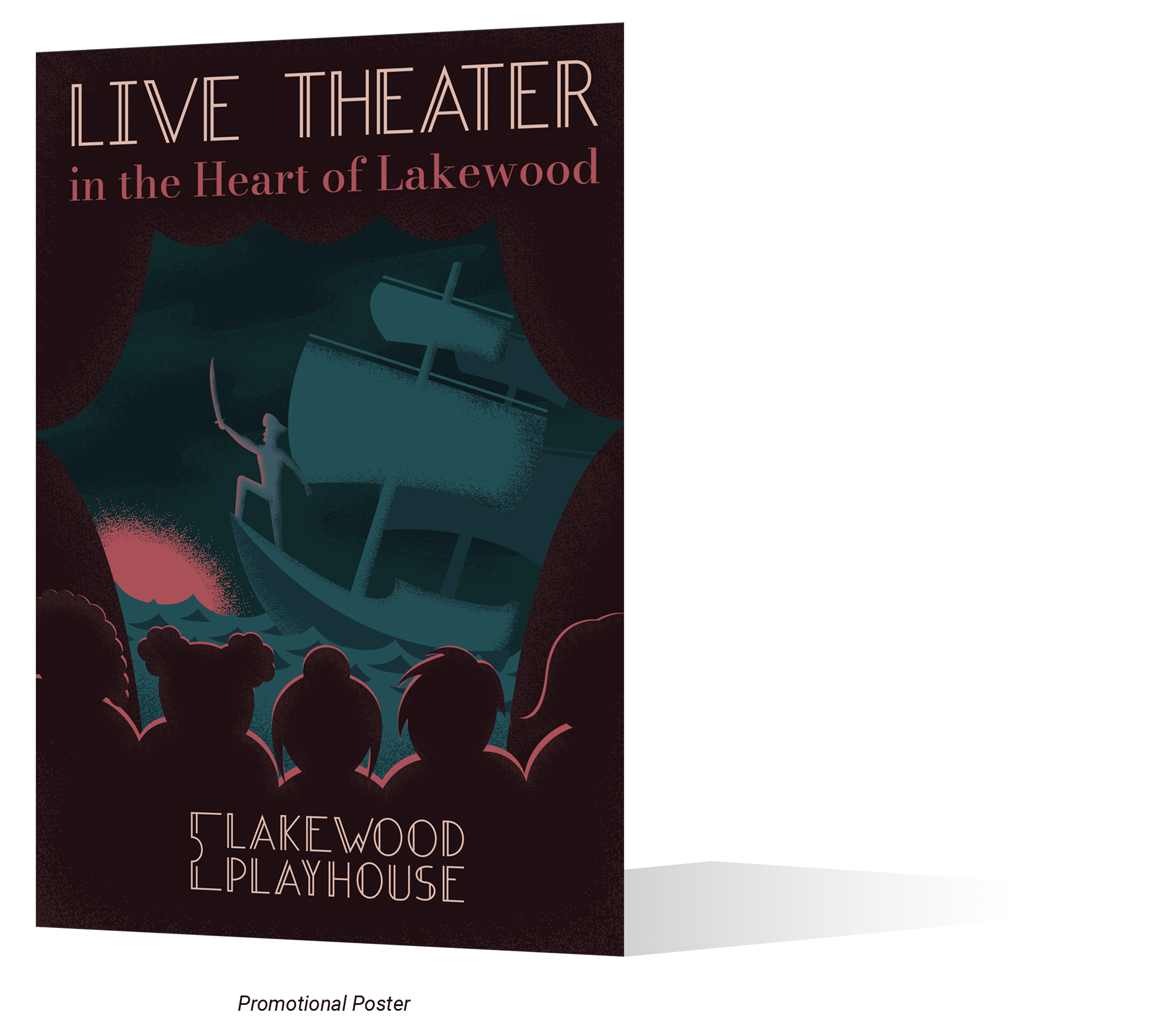
The Lakewood Playhouse is a live theater in the heart of Lakewood, Washington. The theater has been around for almost 80 years and It has evolved a lot since its inception. It’s previous identity system no longer reflected what the Lakewood Playhouse was. The Theater recognized this and decided to partner with my college to create a new direction for their brand.
My design program started a competition to see who could create the most suitable logo for the Lakewood Playhouse. My design was selected and I was really happy because I put an exceeding amount of energy into creating something that would best represent the Lakewood Playhouse.
If you’d like to hear about my design and the Lakewood Playhouse from a different perspective, my college published a story about it:
The design is centered around the idea of a ticket stub. The double-stroked lines of the ticket ends compliment the typeface that I designed specifically for the Lakewood Playhouse. I called this typeface Modern Theater. It’s based off of the double stroked letter forms of classic broadway typography. Modern Theater’s only difference is its thin and geometric lines which is what makes it feel modern. This blend of themes is what I hope allows the Lakewood Playhouse to stand out while holding on to the past of it’s 80 year legacy.
If you’d like to see more of Modern Theater, you can see the complete typeface here:
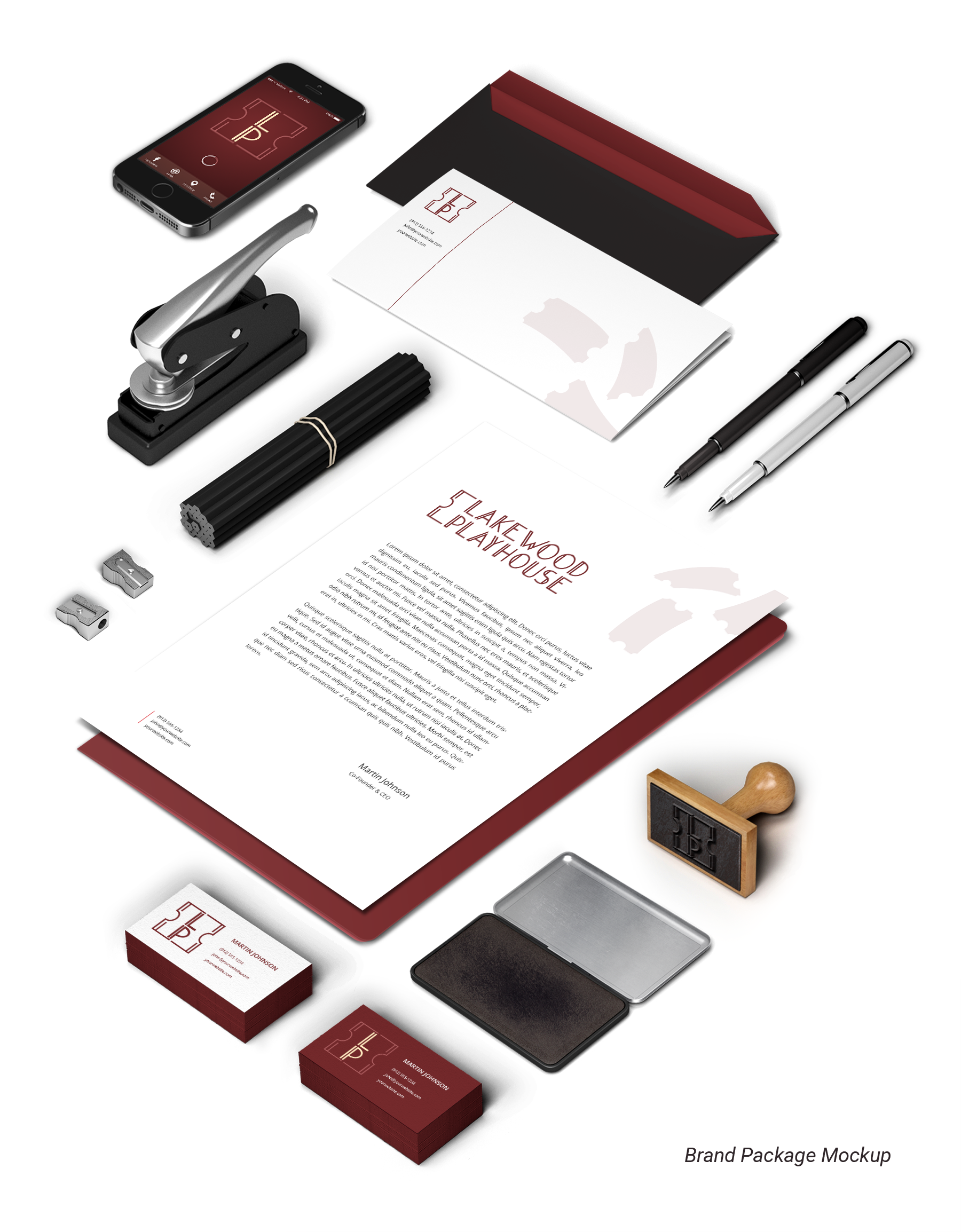
In addition to giving direction to the Lakewood Playhouse’s brand, I supplemented their identity system with a special 80th anniversary Logo, “Modern Theater” as a typable font, an icon pack, and a promotional poster that captures the vivid storytelling of the Lakewood Playhouse.